Juicy News from PULP.
Our flat is really cute
...if I may say so myself.
With it's big bright windows,
white walls & hardwood floors...
it just feel exactly like
a flat in Notting Hill should.
While it may have a winning bone structure,
it has a long way to go in the finish out.
{Editor's Note: Yes, that would be my fault entirely.}
When you live in a rented space,
it's always tough to balance what you want to do
and what you are allowed to do in someone else's space.
After hours of clicking through
wasting nearly an entire tree from sketching out ideas on printing paper,
and wandering aimlessly around IKEA,
I gave up and
decided it was time to call in the experts.
I emailed
and begged principal designer, Beth Dotolo,
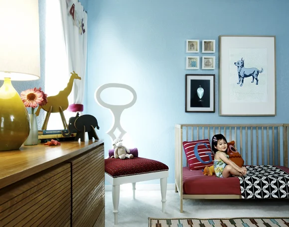
to take on our tiny nursery
and our even-smaller budget for the room.
I was just hoping that our space could have a PULP look-
one that would be both clean & luxe all at the same time.
Guess what?
Not only is Beth helping us,
but she's done an awesome job
of staying in our budget
and creating a look that, I think,
is out of this world.
It's
perfect
for our style,
for our rental constraints,
and... well, we can totally afford it
which makes me happy.
{Editor's Note: It's all still in the works- but once it's finished, I'll share it with you!}
So what does all of this baby room nonsense have to do with you?
Well, this morning
PULP Design Studios
has had a little baby of their own...
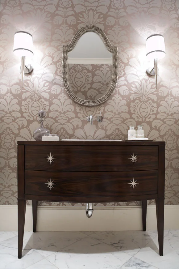
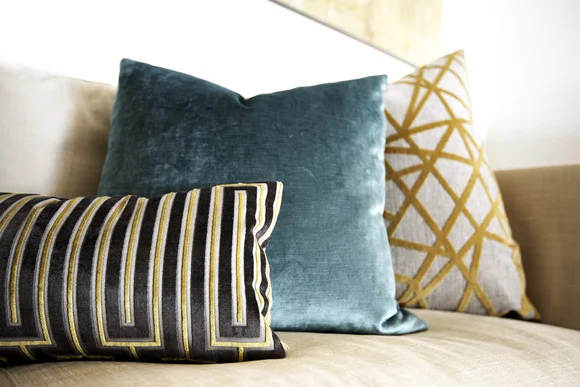
Yes, a store that sells luxe+modern merchandise
that they have designed and produced.
The shop is stocked full of amazing pieces
-both large & small-
that you've seen dotted around their spaces
in press mentions or on
on Pinterest.
The best part is-
Beth is a fellow blogger (Hello, Splendor)
and there is very little that makes me happier
than to see a fellow blogger grow their dreams.
I love when people in our community succeed
and their businesses thrive...
kinda leaves me with a lump in my throat.
Congratulations, Pulp Home!
{Remember us little guys when you're famous. }
*photography by Kevin Dotolo


